USA Tech Recruit Rebranding Story
In this article:

Our rebranding journey began in early 2023. After diving deep into our business objectives and identity, and conducting extensive research, we realized that our brand no longer accurately reflected our company. Our digital assets, including our website, didn’t match the quality and level of service we now provide.
Our old brand and website represented who we were five years ago but no longer aligned with our current position as a leading technology recruitment agency. We’ve progressed, improved, and grown, so our brand image needed to reflect that transformation. It was clear that our brand identity and website were outdated and needed a revamp to align with our current status and future aspirations.
As Chris Canneaux, Director, explained:
“We felt that our old branding and website didn’t reflect our expertise and true focus on the technology industry as effectively as possible, so we wanted to make this the forefront of our new branding.”
Our Goals for the Rebranding Project
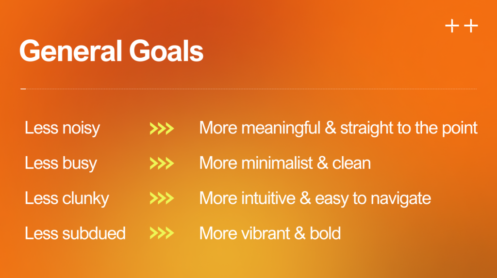
Our main objectives were to create a brand identity and website that mirrored our current standing and future ambitions as a leading technology recruitment agency. We aimed to achieve the following:
- More meaningful, clear, and direct: We wanted to communicate our value proposition and services effectively and concisely.
- More minimalist and clean: We sought to eliminate clutter and distractions, focusing on essential information and elements.
- More intuitive and easy to navigate: We aimed to provide a user-friendly and seamless experience for our visitors and potential clients.
- More vibrant and bold: We wanted to stand out and showcase our confidence and expertise.
Brand Revamp
Our brand update included a complete overhaul of our brand identity, logo, and color palette. While the name of our USA brand remains largely the same—shifting from USA Tech Recruitment to USA Tech Recruit—the European brand underwent a more significant change, evolving from European Recruitment to European Tech Recruit. This change was driven by the fact that the previous name caused confusion, failing to clearly communicate our focus on tech recruitment, which led to inquiries for non-technical roles.
While a broader approach served us well initially, it no longer fits our specialized position as a leader in tech recruitment. By incorporating “Tech” into our name, we’ve clarified our focus, effectively addressing the confusion. In addition to these changes, we also launched a new brand—LATAM Tech Recruit—to better serve the Latin American market, where we’ve been actively operating for some time.
Rethinking Our Logo Design
Our old logo featured an abstract element—a ‘diamond’—alongside the brand name. Initially, we intended to refresh it slightly by updating the brand name. However, as we delved deeper, it became clear that the ‘diamond’ no longer held meaningful significance. The ‘meanings’ previously attributed to it seemed superficial and unnecessary.
One of the core goals of our rebranding was to eliminate the unnecessary while retaining the essence of who we are—clear, concise, and genuine. The ‘diamond’ element no longer made sense. After considering numerous options, we decided to remove it, keeping only the representational, verbal part of the logo. We updated the font as well, choosing one that matched the minimalist, tech-savvy, and sleek design style we envisioned for our new brand and website.
Choosing New Brand Colours
Selecting the right colors was a significant journey. During this process, we revisited crucial aspects of our business, such as our mission and values—who we are, what we do, why we do it, and what we stand for. Answering these questions helped us choose a color palette that matched and reflected our brand identity.
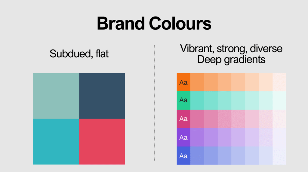
We realized that our old palette of four subdued colors no longer expressed our spirit. The ‘subdued’ aspect wasn’t working for us. We wanted colors that were bold, strong, beautiful, and diverse. In the end, we chose five fresh and vibrant colors.

Do these colors have meaning? Yes, they do. The variety represents our commitment to diversity, equity, and inclusion. The green we selected as the leading color for the European Tech Recruit brand nods to sustainable, green energy—the direction in which the tech world is heading. The orange we chose as the leading color for USA Tech Recruit represents progress and energy, While these factors influenced our decision, the main reason we chose these colors was simply because we genuinely liked them. They resonated with us—they felt right.
As Jenna Thompson, Director, noted:
“I am no marketeer, seeing how many moving parts there are to a rebrand / new website has been eye opening. Ira has done a great job of balancing keeping our company identity whilst also modernising. I am excited by the new website and look forward to never discussing different shades of green again.”
Creating a New Website
Completing the branding part of our project felt like a significant achievement, but the biggest challenge lay ahead—creating the new website.
There were many components we needed to get right, making the task initially seem overwhelming: SEO optimization, writing over 100 pages of content, developing a visually appealing and functional design, and ensuring the website’s structure was intuitive and user-friendly. It’s safe to say a lot of work and effort went into it, but we’re incredibly proud of the result.
Our design direction was guided by our main project goals.
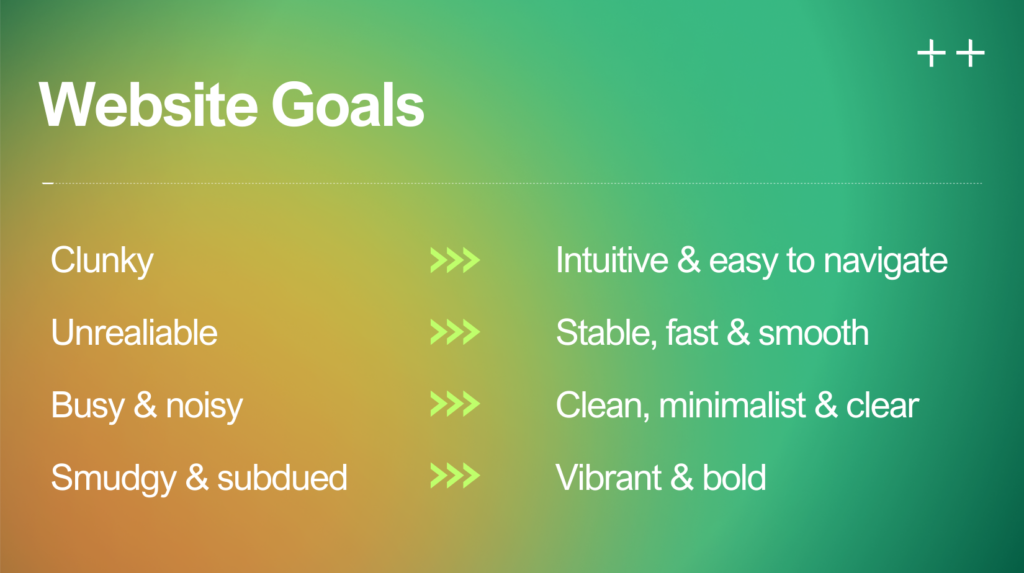
Led by these principles and the brand guidelines we developed, the talented web designers from the Zajno digital design and development agency created a mood board and provided references to capture our vision. Decision-making was easier thanks to the extensive journey of self-discovery we underwent during the branding phase.
The wireframing stage was critical as it defined the website’s structure and user experience. We created both visual and structural wireframes to cover UX and SEO aspects.
Once the wireframes were ready, the Zajno team began working on the design while the USA Tech Recruit marketing team supported by Go Up started crafting copy for over 100 website pages covering the USA Tech Recruit and European Tech Recruit websites. This was one of the most time-consuming stages due to the volume of work and the numerous details that needed attention.
When we handed over the design and finalized copy to the development team, it was a significant milestone—a cause for celebration. We could finally see the finish line approaching. We still had some designs to polish and branding collateral to finalize, but the light at the end of the tunnel was visible.
As the launch date approached, there were many considerations. Besides addressing bugs and supporting the development team with necessary integrations, numerous tasks awaited: ensuring the SEO pre-launch audit was on track, preparing new brand assets for simultaneous rollout across all platforms, updating branded documents and signatures, ordering new business cards, revising business pitch documents and whiteboards to align with the new branding, and, of course, writing a press release to share the whole story—the what, why, and how!
Now that everything is complete, there’s a tremendous sense of relief and satisfaction. After 18 months of dedicated work, the website is finally live. We’re so proud of what we’ve achieved and look forward to working with our new website and embracing our new brand identity—it’s an exciting time for us!
As David Wicks, Founder and Managing Director, expressed:
“It’s been quite a journey from start to finish on what we all felt works for the senior management team, who have all worked for USA Tech Recruit for at least 12-15 years, so are highly invested in the brand and website! Plus, those more on the front lines who gave their input. It’s worked out better than we could have ever expected due to Ira’s diligence, patience, hard work, and talent in this area.”
We hope that by sharing our journey, we’ve provided valuable insight into who we are and the reasons behind the change.
What Has Not Changed?
Despite the changes to our exterior, the essence of who we are and our core values remain the same. Our mission is still to expedite technological advancement by finding the best-fit, top-tier candidates for innovative tech projects.
We take pride in the quality of care we provide to both candidates and clients. Upholding the highest quality standards will always be at the heart of what we do.
We believe in transparency, integrity, and accountability—making no empty promises and staying true to our word. Coincidentally, this is the best way to maintain high efficiency. We never need to embellish our offerings. Fortunately, we’re good at what we do—which certainly helps.
Our commitment to increasing diversity within the technology industry remains one of our key goals. We believe that a variety of unique perspectives is crucial for making the right decisions in this fast-paced era of technological progress.
Rebranding Results and Conclusion
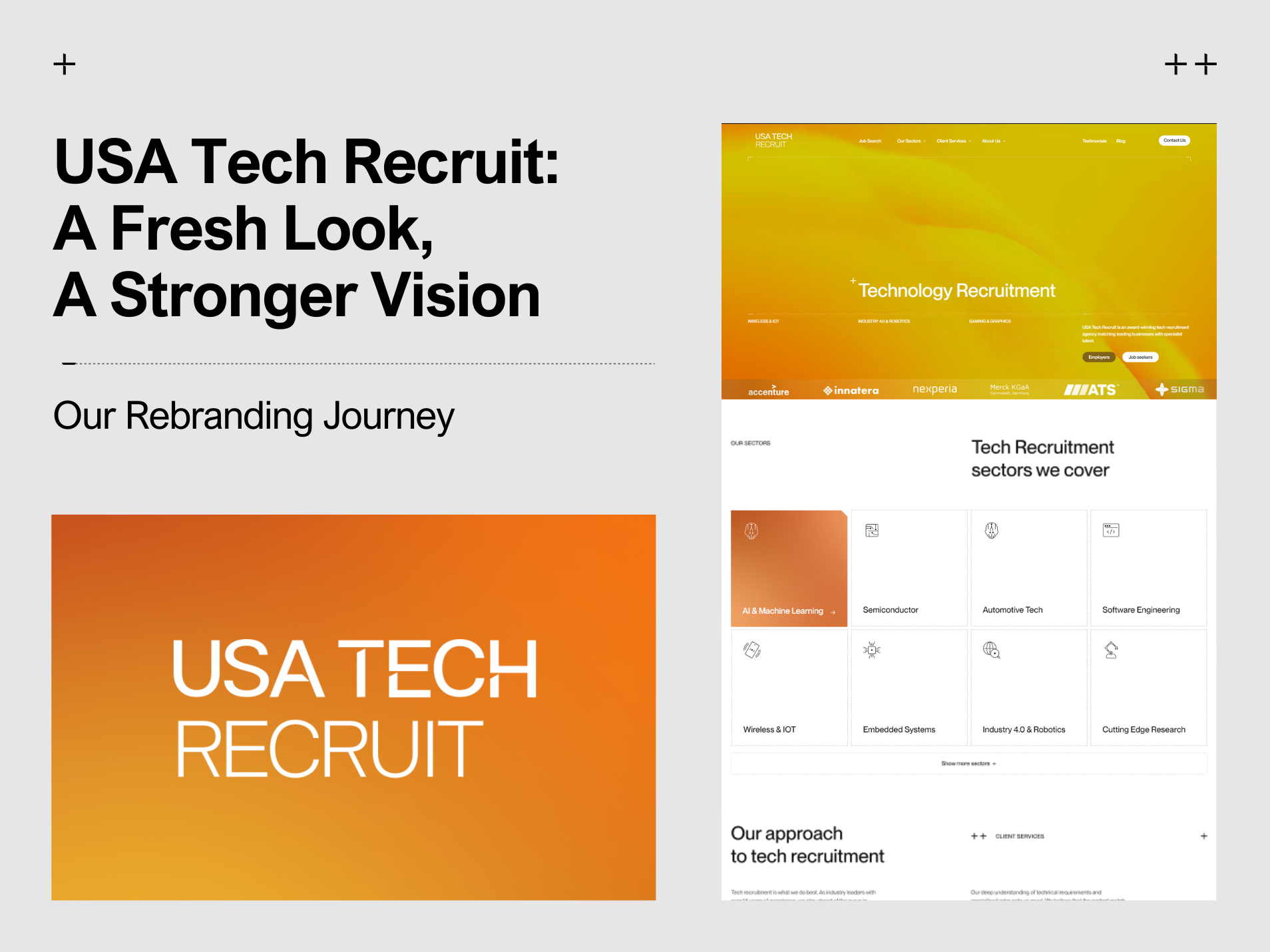
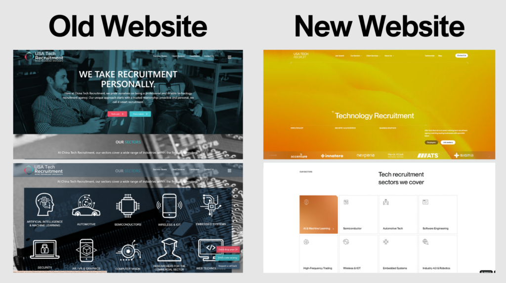
We’re delighted to say that we’ve achieved our goals. Our new website functions better—it’s no longer clunky but is a user-friendly, optimized, and intuitive digital asset with a clear, minimalist, and modern design. Our new logo represents who we are in a neat and clear way, stripped of unnecessary elements. Our new brand colors visually reflect our identity: vibrant, strong, and diverse.
We needed this refresh to tell our story more effectively, to show who we truly are, while creating a top-quality digital product that works smoothly and is most useful for our clients and candidates. This is exactly what we’ve achieved, making this project a success!
Summary of Changes
- Logo
- Before: Brand name with an abstract element
- After: Brand name, stripped of unnecessary elements
- Colors
- Before: Dull and subdued
- After: Vibrant, strong, and diverse
- Design
- Before: Busy, cluttered, outdated
- After: Clean, minimalist, and modern
- Website
- Before: Clunky, poorly structured, and unreliable
- After: Intuitive, smooth, and easy to navigate
As Chris Canneaux, Director, reflected:
“Participating in the rebranding journey of European Recruitment to European Tech Recruit has been an eye-opening experience and a massive learning curve about the nuances of marketing. From conceptualising the website redesign to finalising the new brand identity it was amazing to see it all taking shape. There were various meetings and discussions around logo designs, colour schemes, gradients and fonts and whether this best reflected us as business and the message we want to portray to our clients.
There was a clear goal in mind, to modernise our website to give the best user experience but also to make our message and branding clearer to our clients within the tech industry. I am very excited and proud of what has been achieved and the hard work has led to a modern, vibrant, and clear representation of our company.”
We are excited about this new chapter and look forward to continuing our journey with a brand identity that truly represents who we are today.


